On Perception and Colour by Biyi Wen: Difference between revisions
(Created page with "{{Article |MainNavigation=No }} For the workshop Colour Examination that took place during the Hackers & Designers summer academy in 2018, a program in MAX/MSP programming...") |
No edit summary |
||
| Line 2: | Line 2: | ||
|MainNavigation=No | |MainNavigation=No | ||
}} | }} | ||
For the workshop [[ | |||
[[Category: Publishing]] | |||
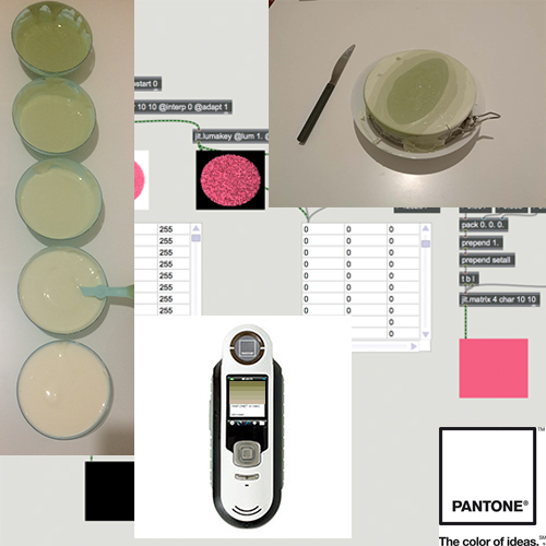
For the workshop [[Color Examination]] that took place during the Hackers & Designers summer academy in 2018, a program in MAX/MSP programming interface was used to read the average value of an image. | |||
In the program, the image is split into four channels: red, green, blue and opacity. Then, on the RGB channels the value of each pixel is added incrementally to a sum, which when divided by the amount of pixels is the average value of the channel. At the end of this process the three layers are sandwiched back together. | In the program, the image is split into four channels: red, green, blue and opacity. Then, on the RGB channels the value of each pixel is added incrementally to a sum, which when divided by the amount of pixels is the average value of the channel. At the end of this process the three layers are sandwiched back together. | ||
Latest revision as of 15:27, 28 December 2020
For the workshop Color Examination that took place during the Hackers & Designers summer academy in 2018, a program in MAX/MSP programming interface was used to read the average value of an image.
In the program, the image is split into four channels: red, green, blue and opacity. Then, on the RGB channels the value of each pixel is added incrementally to a sum, which when divided by the amount of pixels is the average value of the channel. At the end of this process the three layers are sandwiched back together.
This program was initially developed for a project that aimed to measure IKEA’s colour scheme. I was told, via an anecdote, that its colour scheme is reflective of the natural landscape and raw material available in Scandinavia. For example the light color schemes used in IKEA’s wooden furniture are reminiscent of the colour of pine.
Although, if we think in more detail, this speculation could be easily disproved. IKEA manufactures oak furniture, which is of a darker tone. But it is the association between colour and landscape here that is interesting.
The unpruned perceptual field is a primal chaos. In The Art of the Relational Body: From Mirror-Touch to the Virtual Body, Massumi interpreted synaesthetic experience as an exuberant hyperdifferentiation, rather than a lack of separation between the senses. The development of the human mind has practically extinguished all feelings, except a few sporadic kinds, sound, colors smells, warmths, etc., which now appear to be disconnected and disparate.[1]
It cannot be the case that the perception of colour is as direct as the program plots out. As IKEA outsources its production outside of its native homeland, the association between its colour palette and natural landscape is not as direct as it may seem. How the intricacies of colour production can be unravelled and reviewed is called into consideration.
[1] Brian Massumi, The Art of the Relational Body: From Mirror-Touch to the Virtual Body, Mirror-Touch Synaesthesia: Thresholds of Empathy with Art, Daria Martin (ed), 2017
